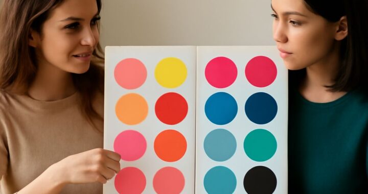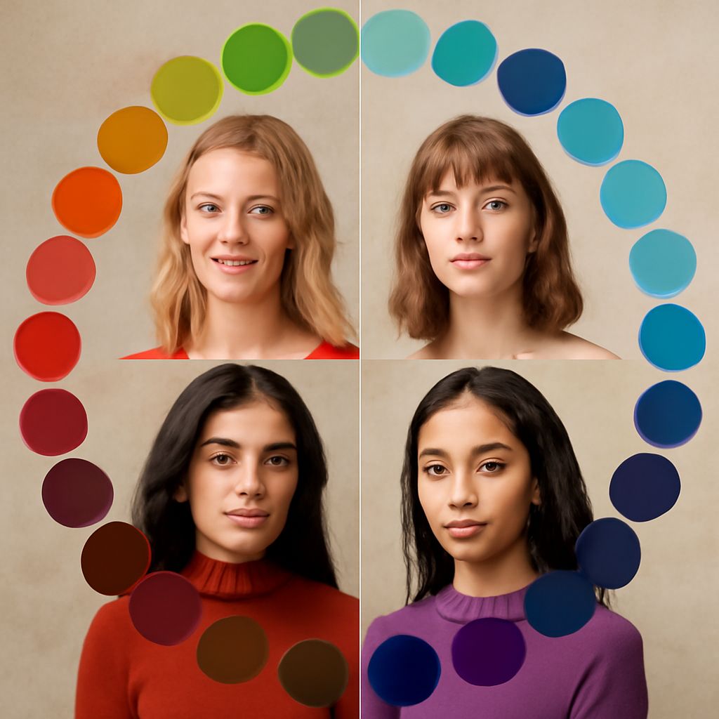
Seasonal color analysis identifies the colors that harmonize with your natural temperature, value, chroma, and contrast. The cool winter color palette is cool, clear, and high contrast, but not everyone who suits strong colors belongs to winter.
Use the same four-part system to distinguish cool winter, bright winter, cool summer, light summer, true spring, and warm autumn. Your best palette should make your skin look even, your eyes look clearer, and your features look balanced.
How the Cool Winter Color Palette Works: Temperature, Value, Chroma, and Contrast
Four dimensions create a useful seasonal color profile:
- Temperature: Cool colors have blue, pink, or violet qualities. Warm colors lean yellow, peach, orange, or golden.
- Value: Value describes lightness or darkness. Powder blue is light; navy is dark.
- Chroma: Chroma describes intensity. Clear cobalt has high chroma, while dusty blue has lower, softer chroma.
- Contrast: Contrast measures the visual difference between your features and the colors you wear. Black with optic white creates more contrast than gray with soft blue.
Cool winter is distinctly cool, usually medium-to-deep in value, high in chroma, and high in contrast. Wear blue-based red, sapphire, cobalt, icy pink, emerald, charcoal, black, optic white, and cool navy. These colors look crisp rather than dusty or earthy.
For makeup, try berry lipstick, blue-red, cool rose blush, and gray, navy, or plum eye color. Silver, platinum, and white gold usually support this palette better than yellow gold. Do not classify your season from hair color alone; skin response and overall contrast matter more.
Bright Winter Color Palette: High-Contrast Colors for Clothing, Makeup, and Metals
The bright winter color palette has the clearest, most energetic colors in the winter family. It is often neutral-cool, so it can handle a few vivid colors that appear slightly warm, provided they remain clean rather than muted.
Choose electric blue, vivid magenta, true red, icy turquoise, hot pink, bright emerald, black, and pure white. Strong color blocking works especially well: try black with fuchsia, cobalt with white, or red with charcoal.
Bright makeup includes clear red, fuchsia, raspberry, cool pink, and sharply defined black or navy liner. Polished silver, platinum, and white gold reinforce the palette. Compared with cool winter, bright winter needs more visual sparkle and saturation; overly smoky colors can make it look flat.
Cool Summer Palette: Soft Colors for Clothing, Makeup, and Metals
The cool summer palette is cool, gentle, and more blended than winter. It usually combines medium value, soft chroma, and low-to-medium contrast. Instead of stark black and white, choose blue-gray, soft navy, slate, lavender, periwinkle, dusty rose, raspberry, and muted teal.
Cool summer clothing looks polished when colors flow together. Try slate trousers with a lavender top or soft navy with rose pink. Makeup works best in mauve, cool pink, muted berry, rose brown, and gray-plum shades. Silver, pewter, cool rose gold, and soft white metals are natural choices.
The light summer color palette is the lighter neighboring option. It favors powder blue, shell pink, lilac, light gray, seafoam, soft raspberry, and pale denim. Light summer makeup should stay sheer and delicate, such as soft rose, pink-beige, and light mauve. If medium-depth summer colors overwhelm you, test these lighter shades near your face.
Cool summer and light summer can both wear cool, softened colors. The difference is value: cool summer accepts more depth, while light summer needs an airy, low-contrast effect.
True Spring Color Palette: Warm, Clear Colors and Neighboring Seasons
The true spring color palette is genuinely warm, clear, and lively. It typically sits in the light-to-medium value range with medium-to-high contrast. Wear coral, warm turquoise, clear peach, daffodil yellow, leaf green, warm aqua, tomato red, camel, and ivory.
For makeup, choose peach blush, coral or warm red lipstick, apricot, and golden brown around the eyes. Yellow gold, bright gold, and warm brass complement the palette better than icy silver. True spring colors should look fresh and sunny, not gray, dusty, or heavily shaded.
The warm autumn color palette is also warm, but it is deeper, richer, and more grounded. Try rust, terracotta, mustard, olive, moss, camel, chocolate brown, warm teal, and paprika. Brick lipstick, cinnamon blush, bronze eyeshadow, copper, and antique gold create a cohesive effect.
These neighboring palettes are easiest to separate by comparing temperature, depth, and clarity:
- Cool winter versus bright winter: Both handle contrast, but cool winter favors icy, blue-based colors. Bright winter needs the clearest, most saturated versions.
- Cool winter versus cool summer: Both are cool, but winter needs sharper contrast and stronger chroma. Summer looks better in blended, softened colors.
- Cool summer versus light summer: Both are gentle and cool. Light summer requires the palest values, while cool summer can wear more medium-depth shades.
- True spring versus warm autumn: Both are warm. Spring is clearer, brighter, and fresher; autumn is deeper, earthier, and more muted.
- True spring versus bright winter: Both can wear vivid color. Spring needs a golden warmth, while winter looks better when the color has a blue or neutral-cool base.
Test uncertain colors with fabric or clothing placed directly below your face in natural daylight. Compare similar shades, such as coral against blue-red, ivory against optic white, or rust against bright orange. Look for smoother skin, brighter eyes, and less visible redness.
Repeat the test with lipstick or blush, then compare silver, yellow gold, and antique gold near your face. The best choice should support your features without creating shadows, sallowness, or a disconnected-looking color.