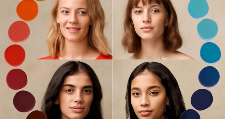
Your spring palette or winter palette should make your complexion look clearer, not compete with it. Spring colors look warm, light, and lively, while winter colors look cool, crisp, and strongly contrasted.
The main distinction is not simply light versus dark. Compare each palette by temperature, value, chroma, and contrast. Those four cues show whether warm clarity, cool depth, or maximum brightness suits you.
Spring palette vs. winter: temperature, value, chroma, and contrast
Temperature describes whether a color appears warm or cool. Spring is warm or warm-neutral, with yellow, golden, peach, and coral undertones. Winter is cool or neutral-cool, with blue, pink, and icy undertones.
Value describes lightness or darkness. Spring usually ranges from light to medium value, although some spring shades reach medium depth. Winter can include deep charcoal and black, but it also includes icy pastels and bright white.
Chroma means color intensity. Both seasons favor clarity rather than grayness, but they express it differently:
- Spring: warm, fresh, clear, and moderately to highly saturated.
- Cool winter: cool, crisp, medium-to-deep, and highly contrasted, with less neon intensity.
- Bright winter: neutral-cool, extremely clear, highly saturated, and dramatically contrasted.
Contrast measures the difference between your coloring and the colors you wear. Spring usually looks best in medium contrast, such as peach with warm turquoise. Winter generally handles high contrast, such as optic white with black or cobalt with fuchsia.
Many people ask, “what are winter colors?” A practical answer is cool, clear shades such as sapphire, icy pink, blue-red, emerald, charcoal, optic white, and black. A winter color can be pale, vivid, or deep; darkness alone does not define the season.
Spring colors: warm wardrobe and makeup choices
Spring colors have a sunny, energized quality. Choose coral, peach, apricot, warm turquoise, clear aqua, apple green, ivory, camel, and warm navy. These shades create color without the stark effect that black and optic white can produce.
- Wardrobe: Try a coral blouse with ivory trousers, or warm turquoise with camel. Medium contrast usually looks more natural than black-and-white combinations.
- Neutrals: Select cream, warm beige, honey brown, light camel, and warm navy instead of icy gray or blue-black.
- Makeup: Choose peach blush, coral or warm pink lipstick, golden champagne eyeshadow, and brown or bronze eyeliner.
Grayish mauve, dusty rose, icy lavender, and stark black may drain a spring complexion. If a color makes your skin look dull while the fabric appears attractive, the shade is probably too cool, deep, or muted.
Cool winter palette: icy depth, wardrobe, and makeup
The cool winter palette emphasizes blue-based color and polished contrast. It often suits sapphire, royal blue, blue-red, cranberry, icy pink, icy lavender, pine green, charcoal, ink navy, and pure white.
- Wardrobe: Pair charcoal with icy pink, ink navy with pure white, or sapphire with cool gray. These combinations look refined without relying on black.
- Neutrals: Choose charcoal, cool navy, black, crisp white, and blue-gray. Warm camel, orange, peach, and yellow-beige can look disconnected.
- Makeup: Try cool rose or berry blush, blue-red lipstick, plum or raspberry accents, silver highlight, and charcoal eyeliner.
Cool winter is not identical to bright winter. Cool winter favors icy clarity and cool depth, while an intensely neon shade may overpower you. If cobalt, fuchsia, and electric purple look too forceful but sapphire, cranberry, and icy rose harmonize, cool winter is the stronger match.
Bright winter palette: clear contrast and the side-by-side draping test
The bright winter palette suits exceptionally clear, high-impact color. Test electric blue, fuchsia, true red, emerald, vivid violet, bright magenta, optic white, and black. Bright winter often handles the strongest contrast of the three palettes.
For clothing, combine optic white with black, fuchsia with emerald, or true red with clear navy. Makeup can include vivid pink or blue-red lipstick, cool raspberry blush, silver eyeshadow, and sharply defined black or charcoal liner. Keep the color clean; dusty or brown-heavy versions usually reduce the effect.
Use this repeatable draping test to compare spring, cool winter, and bright winter shades:
- Stand in indirect daylight without strong makeup, and wear a neutral top. Keep the fabric about two inches below your chin.
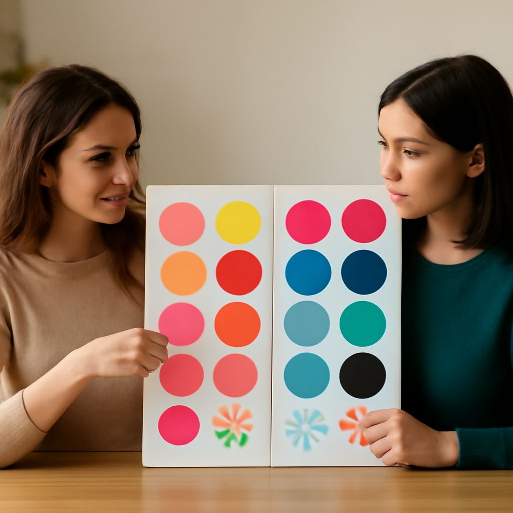
- Compare similar colors in pairs: peach against icy pink, warm ivory against optic white, coral against fuchsia, and warm turquoise against electric blue.
- Hold each fabric in the same position for several seconds. Look at your face, not the fabric. The better shade should even your skin, clarify your eyes, and soften shadows.
- Identify the failure pattern. Too-cool spring comparisons can make you look gray; too-warm colors can emphasize redness on a winter complexion; overly bright colors can dominate a cool winter face.
Warm coral, peach, and golden ivory winning consistently points toward spring. Icy rose, sapphire, and charcoal winning points toward cool winter. If electric blue, fuchsia, and optic white make your features sharper without creating shadows, bright winter is the better fit.